Daphbio.
Is a saltwater aquarium product brand in the south of France.
They contacted me in order to refresh their packaging and website.
As you can see below, the brand needed a completely new start.


As they only had an old logo they liked but no visual guidelines, I decided to scope a little further.
The final decision was to produce all brand guidelines but also include notions of marketing strategy.
Starting with the strategy, we studied the market along with the data Daphbio could provide us from their website.
Along with their founder and CEO, Benoit Locatio, we targeted a gap in the market and took the unilateral decision to position Daphbio as THE reference for top quality saltwater aquarium.


Working in collaboration with a super-talented graphic designer, Josh Evans, we kicked off the graphic research with three distinct routes.
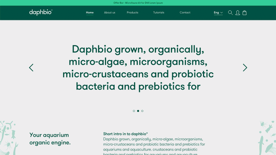
A super premium Green/Dark green one, would elevate Daphbio and help them stand out from the competition.
A playful, Sea and Coral-inspired one, aiming for the brand to be more memorable and fish product at first sight.
An in-between one, using the A of Daphbio to create a sea-wave, while using shades of blue to elevate the brand.
Bearing in mind to re-integrate the little Daphbio graphics from the previous logo in a more dynamic manner for each route, but separating it from the logo, this way removing a lot of constraints and visual complexity.


Benoit picked the premium, dark green route.
We refined it further and prepared assets for various platforms.
Using an even darker green, to create a more premium look and feel, in line with Daphbio Value.
We also made sure the range would be easily recognized within the shop aisle, as most competitors were using blue and orange colors, setting Daphbio as a memorable organic brand for the years to come.

.jpg)


Aiming to use dark green as the Daphbio core color, we then had to update all packaging due to legal requirements, to be 100% sure products wouldn't be mistaken with one-another as excessive/wrong usage would poison the user's aquarium.
It forced us to keep their previous packaging colors as a primary color for each, but Josh found yet another pretty way to flip this and make these packagings shine.


Benoit was truly delighted by the overall design process.
Sent us many delightful messages when discovering their new bottles, ..
And I had information from their web engineer that sales picked up by +8% in the first month, +17% in the first year. Thanks to our designs (And a little bit of SEO optimization also, for sure).
Ask me via email if you'd like to see the full document.
Sadly, at the last minute, when it was all done, printed, and Live, Benoit pulled a cheeky move to save himself a few bucks.. and decided not to pay us in full, forcing me to take legal action.
Hopefully, thanks to ''Enveloppe Soleau'' France law tools that I prepared in advance, we managed to demonstrate that we produced all the SOW content and created the assets they were now using.
Benoit had to pay us in full,
but it still left us with a bitter aftertaste knowing we boosted their sales and overall growth capacity so much.